On the Way series at the KALEID Gallery

The new three piece series, On the Way, and another small work, Gathering I, will be a part of the upcoming annual HARK! exhibit and sale at the KALEID Gallery.

The On the Way series is my exploration of people in transit, both literally, on foot, and metaphorically as a state of mind, the experience. I kept the details to the minimum because they would be a distraction to the notion of “here and now” that in this case was more important to me then particular surroundings or the final destination. Oil pastel is a perfect medium for this; it does not eagerly land itself for a lot of details, so staying vague is pretty easy.

On the Way I - Faber-Castell oil pastel on Strathmore colored paper, 8" x 10"
On the Way I – Faber-Castell oil pastel on Strathmore colored paper, 8″ x 10″
On the Way I - Faber-Castell oil pastel on Strathmore colored paper, 8" x 10"
On the Way I – Faber-Castell oil pastel on Strathmore colored paper, 8″ x 10″
On the Way I - Faber-Castell oil pastel on Strathmore colored paper, 8" x 10"
On the Way I – Faber-Castell oil pastel on Strathmore colored paper, 8″ x 10″

The opening reception will be held during the San Jose First Friday, on December 6th, 2013 from 7 pm till 11 pm. If you are in the area, stop by to see high quality art of amazing variety and to chat with the artists.

The exhibition will continue until January 18th, 2014.

KALEID Gallery is located at 88 S 4th St, San Jose, CA 95112.
Open Tuesday – Friday from 12:00 pm till 7:00 pm, Saturday from 12:00 pm till 5:00 pm.

The original of On the Way III ($120.00), greeting cards, and prints of all three drawings are available in my Oil Pastel online gallery.

The originals of “On the Way I” and “On the Way II” went to their new good homes!

A new piece at the Art Under $200 exhibit at the Pacific Art League

I am pleased to announce that both my pieces submitted to the Art Under $200 exhibit at the Pacific Art League have been accepted.

You probably saw this one already:

Open Space - pastel pencil on drawing paper, 5" x 7"
Open Space – pastel pencil, 5″ x 7″

And this is a new artwork that was not shown anywhere else yet:

River of Light - pastel pencil on Canson drawing paper, 5" x 7"
River of Light – pastel pencil on Canson drawing paper, 5″ x 7″

The opening reception for the exhibit will be a part of the Palo Alto First Friday, on December 6th, 2013, from 5:30 pm till 8:00 pm.

The exhibit will stay open till December 24th.

Pacific Art League is located at 668 Ramona St, Palo Alto, CA 94301.
Open Monday – Friday from 9:00 am till 5:00 pm

River of Light

This is another piece in the “small landscapes” series that was started long time ago, survived a two year interruption, and is finally getting done. It’s always difficult to pick the pencils again when you almost don’t remember what you had in mind in the beginning. But as a nice exception to the rule, this little drawing was finished relatively easily. It was almost all about playing with colors and almost no struggling through the process.

The first piece in the series was Open Space, and if all goes well there will be three more.

The original ($140.00), greeting cards, and prints are available in my Pastel Pencil online gallery.

Gathering (a rocky one)

Gathering I, by Yelena-Shabrova - pen & ink on drawing paper, 4" x 6"
Gathering I – pen & ink on drawing paper, 4″ x 6″

Commission a similar drawing

This one started as an exercise after I haven’t done any pointillism in more than a year. In the process of getting the feel of the pen again I began to see a composition in the bunch of rock textures and from that point treated the small drawing more seriously.

The horses came into the picture last to make things more interesting. I thought of lighter-colored petroglyphs etched on a dark rock surface and decided to reverse colors. That seemed to work better with the rest of my rocks.

There is another Gathering piece in the making already. Turned out playing with rocks in black and white is just as exiting as doing it in color.

The original drawing ($80.00) and high quality 4″ x 6″ giclee prints are available in my Pen and Ink online gallery

Further experimenting with canvases

Looking back at all my attempts to make colored pencils play nice with the digital canvas, I have to admit that they certainly prefer a traditional linen one. So the blank digital canvases that I still have will be used for other media. For example, a graphite pencil:


Miniature – graphite pencil on canvas, 3.5″ x 2.5″

Things learned with this one:

– only soft graphite works, harder grades scrape the priming off the canvas without leaving noticeable marks
– for blending, small sponge makeup applicators and bristle brushes work best
– common erasers are of little help when you need a highlight or to scrape off a mistake, but kneaded eraser works wonderfully (I am using a Koh-i-Noor Hardtmuth eraser that comes with its own case and like it better than other brands I had before)
– an x-acto knife can be good for small bright highlights, but using it requires care because it easily gets deep into priming and scrapes it off
– areas treates with a x-acto knife are still good for blending tools, but pencil marks behave unpredictably, so better be avoided

My other canvas experiment that is yet to be finished is a mix of the black India ink and graphite. I am not sure how I like the result so far, but we’ll see.

Miniature on canvas with a boardwalk

Miniature - colored pencil on canvas, 3.5

This one was created with Derwent Coloursoft pencils, not my usual Prismacolor. The good thing is that these pencils are really, really soft and blend together easily. The bad thing is that in just a few layers it becomes impossible to add more color. The next stroke tries to lift off what’s already on the surface. This is not such a big deal with lighter colors, but getting good darks with Derwent on canvas (at least on a digital one that was used for this piece) turned into a challenge. The solution: use a softest graphite pencil you have. Koh-I-Noor Hardtmuth 7B worked quite well for me.

New miniature on canvas

Miniature - colored pencil on canvas, 3.5
colored pencil on canvas, 3.5″ x 2.5″

Most of this one was done with an artificial light, and today I was going to put finishing touches on it while we were at the Pescadero Beach. But the sunlight showed me that more than just that was needed. Good thing that the weather was very warm and without strong winds, or the miniature would travel back home to be finished there. I must say though that colored pencils start to lay on the canvas in a funny way as humidity goes up. I think if I was working with water soluble ones, I would end up with a painting without adding water.

Getting a hang of it (digital canvas, that is)

Finally, a miniature on a digital canvas that was not a struggle:

Miniature - colored pencil on canvas, 3.5" x 2.5"

colored pencil on canvas, 3.5″ x 2.5″

I noticed that colors almost do not smear at all on this type of canvas and put dark branches first, then moved to the clouds. It worked – branches stayed dark, clouds stayed clean, no mess at all. And it probably helped that I used harder Derwent pencils for the branches and my usual Prismacolor ones for the rest.

A new miniature and a rather unpleasant discovery

Miniature - colored pencil on canvas, 3.5" x 2.5"

colored pencil on canvas, 3.5″ x 2.5″

That’s the pleasant part, always good to finish even a little piece. Now, the unpleasant one: this miniature, like the previous two, was done on a digital canvas, and apparently it has a shorter patience with multiple layers of color than a traditional canvas does. In the process of “thinking” about earth colors right on the canvas I found out that I better make up my mind quicker, or the color will start to chip off. It didn’t really come to chipping off, but from my previous experience with paper I know the feeling that the pencil gives you right before the surface gives up. That’s a little disappointing, or maybe it’s a good opportunity to learn how to be more decisive.

A miniature that traveled to Russia and back

That’s right, this little piece went with me over half of the globe and back. I had big drawing plans while visiting with my family and friends in Russia, and as it usually happens very little of it got accomplished. In fact, this is the only thing I managed to finish in 3 weeks, all done either in flight or in airports. Yay for working small.

Miniature - colored pencil on canvas, 3.5" x 2.5"

colored pencil on canvas, 3.5″ x 2.5″

A mini sunset and a new surface

colored pencil on canvas, 3.5" x 2.5'

As much as I enjoy the gessoed canvas, it has one serious problem when it comes to colored pencils: the unsupported area inside the mini stretcher bars. I found two workarounds: working with a very sharp point that does not require much pressure and keeping a finger against the back of the canvas when I need to burnish. Unfortunately, burnishing does not happen without pressure.

Slava suggested to try a digital canvas on a piece of wood. We had a few samples left from the time when he was in the process of finding the best canvas for his photography, and he stretched one for me. The sunset above is my first mini landscape on the new surface. Lessons learned:

– a digital canvas is finer and more dense
– it has more “tooth” (or what should it be called in this case?), and even a slightly dull point will leave white gaps on it
– it is not possible to correct small mistakes with a white pencil on a digital canvas
– all strokes, even those made with a dull point, look harsher on a digital canvas than on a traditional one

It feels like a good surface, I just need to adjust to it.

Fall colors – a new miniature

Fall colors are almost non-existent outside of urban areas here. The best we see when hiking is a few colorful trees or shrubs here and there. The rest is either brown or green that later turns bare. But there is a a nice aspen grove at the edge of the Stevens Creek Park, it actually turns golden in October. It’s a wonderful sight then – glowing trunks and branches against bright yellow foliage. The only thing that can make it better is a backdrop of either blue skies or water.

miniature - colored pencil on canvas, 3.5" x 2.5"

colored pencil on canvas, 3.5″ x 2.5″

I know that Sunol Park looks pretty impressive in fall too, but for one reason or another we keep missing its autumnal beauty every year.

Artist Trading Card Exchange at CAG

We had an artist trading card exchange at today’s CAG meeting. Here is my contribution:

My trading card - colored pencil on illustration board, 2.5" x 3.5"
colored pencil on illustration board, 2.5″ x 3.5″

That’s my first experience with the illustration board, I am not sure if I liked it. The thing has no tooth at all, very weird. Not sure who got my card, the exchange took place at the very end of the meeting and was a little hurried.

And this is what I got from a fellow CAG member, Sharon LaBouff:

My trading card - colored pencil on illustration board, 2.5" x 3.5"

I am very pleased to have Sharon’s little piece.

Fitting cumulus clouds into a tiny space

As it turned out, you can fit quite a lot into 3.5″ x 2.5″, more than I hoped to. If I planned a little more carefully, there would even be more space for the water at the bottom. Instead, I ran with the clouds first and fitted the rest into what little space remained. Morale: even for a tiny piece, start with thumbnails. I would love to do something with cloud reflections.

miniature - colored pencil on canvas, 3.5" x 2.5"

colored pencil on canvas, 3.5″ x 2.5″

Cover illustration for a book in progress

About two months ago I received a rather unusual request to create an illustration for a book that was not finished yet and didn’t have a title. All I had to go by was a short foreword and a few more details from the author. The interpretation and medium was left up to me. On one hand, it was very enticing to have that much creative freedom, on the other, it was as reassuring as walking through a thick fog. The temptation prevailed.

To make myself feel a little better, I sent the author a rough sketch of what I had in mind, and to my surprise she enthusiastically approved it. Since I didn’t know which parts of the storyline are going to be the most prominent in the book, I went with the main theme of an abrupt change from a farm teen to raising the son on her own in a city. The shadow in the illustration is the girl’s son in the end of the book, grown up and capable of supporting herself, her concern for years and a final reward. Today I turned the illustration to to the author. Thankfully, she loved the finished work which made me happy. She is till working on the book, hopefully the illustration will give her an extra creativity nudge.

Cover illustration for a book cover

colored pencil on drawing paper, 9″ x 12″

Artists party 2010 at the KALEID Gallery

Yesterday KALEID celebrated the 4th year of it’s very temporary existence on the 4th Street in San Jose. I think we had fewer people than last year, but the party was very nice nonetheless. I didn’t see most of the artists since last December, and talking to them again was a real pleasure. Funny how we forget names but remember each others’ faces 🙂

Since we came early, I could take a good look at the Rockin’ Stockings art show. Each artist’s works were hung together, and stockings with artist names were painted on the wall under them. Very cute 🙂

Also, found an artist I don’t think I saw before: Megan M. Eckman of Studio M.M.E.. She has wonderful pen and ink illustrations in KALEID. There was another artist whose work looks like illustrations, all with unusual perspectives, but there was no name anywhere on the display. I know that there was an article about her (or him?) some time ago in the Phantom Galleries blog, but of course now I can’t find it. Why, oh why do artists make it difficult to locate their name?

The best part of the evening was of course the gift exchange. All gifts were unwrapped on the spot, so that we all could see what it was and who created each piece.

I finally ventured into the land of collages with my gift, but since I could not find about half of the paper I knew I had, the result was not exactly what I originally planned. Not sure if the original idea would survive anyway since paper was not tearing predictably and there was no telling up front how a particular type of paper would take colored pencil.

It was fun working on the collage anyway, and Keith Bunnell seemed to be happy with it. Keith is a Raku artist whose beautifully shaped and glazed mug I picked earlier that evening from under the Christmas tree.

Gift exchange is a random process, and Cherry even shuffled the gifts to make sure no one could tell which gift was brought by which artist. Keith and me were the only two who picked each others’ creations.

Flashes of memories - torn paper collage, 5
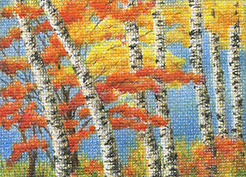
Flashes of memories – torn paper collage, 5″ x 7″

Raku mug by Keith Bunnell
Raku mug by Keith Bunnell. You can’t tell it from the photo, but the mug is just as beautiful inside with random spots of black and dark earthy colors.

Another tiny canvas

3.5 x 2.5, colored pencil on canvas

3.5″ x 2.5″, colored pencil on canvas

I really like working that tiny. The stretched canvas make it easy to draw anywhere, without any support. A canvas and a few pencils fit into my smallest purse, and apparently a grip of a shopping cart is good enough to rest the canvas on when you stand in a long line (Costco has no equivalents of a “3 is a crowd” rule, and sometimes it can be a long wait). Drawing to the rescue.

Experiment with colored pencils on canvas

Following up on my initial idea of trying colored pencils on a canvas, I bought a pack of 5 2.5″ x 3.5″ primed canvases in Aaron Brothers and started with the first canvas the same day. It’s a remarkable thing for me; usually it takes days, if not weeks, to progress from an idea to something material. Here is the result:

miniature - 3.5 x 2.5, colored pencil in canvas

It’s doable! And I like the effect that the rough support gives to the drawing. It reminds me of heavy cold pressed watercolor paper. Just like with that paper, canvas is lead hungry. It gobbles up serious amounts of colored pencil in no time at all, and I had to sharpen pencils more often than with most types of paper. On a positive side, a canvas leaves more room for mixing colors. A few things that I didn’t like I was able to scratch off with a fingernail and cover with new layers. No ill effects of doing so; the canvas does not seem to wear out at all.

I still need to get a better grasp of the whole thing, but when i am through this pack of canvases I think I will move to a bigger size. My first ides that never came to fruition was to wrap cold pressed watercolor paper around the stretcher. I even bought the small stretcher, and that was it. Wetting the paper, stretching it, drying it, seeing if drawing on that was plausible, and dealing with a possible fail was too much trouble. I wonder why I didn’t think of the canvas back then.

Speaking of the packs: not a single one in the store had 5 more or less rectangular canvases. A common case was 2-3 arbitrary quadrangles per pack that just look bad, so ordering online is not an option. I do want to continue with these tiny drawings.

On the Racetrack III

On the Racetrack III – 11 3/8″ x 8 3/8″, pen and ink on drawing paper

The third and final part of three drawings inspired by Bay Meadows, a racetrack that, sadly, does not exist anymore. We used to visit it regularly, and it was always a pleasure for us and our kids to spend a day there. Now the long stretch of stands, the smell of the paddock, the turf and the sight of stables and horses everywhere are all gone to yield space to houses and office buildings.

Scinthia

Scinthia – 4″ x 6″, charcoal on drawing paper

This is what I hope to be the return of my long lost love for portraits. I mean human portraits. Horses were always fine and still are. But I haven’t draw a single human face in more than 15 years except for an occasional sketch here and there. It’s coming back now an feels like slipping in old comfortable shoes. “Scinthia” is not a real person, it’s my guess at what the name might look like.

Fortitude

Fortitude – 9″ x 6″, colored pencil on drawing paper

“Fortitude” is an ode to the plant that grows in our patio. I can never remember what it is called. But whatever it is, it survived a serious frostbite last winter, had to be completely chopped out, and in a few months came back as lush and healthy as ever. Right now this plant with an unmemorizable name is taking over the patio despite the heat. I keep hoping that it will stop on its own and I won’t have to trim it. It would be difficult to decide which parts to take away.