
2014 Bay Area Wildlife Exhibit at Filoli
I will have three small pieces on display at Filoli from Tuesday, September 9 through Sunday, October 26, 2014:


The exhibit will be held in the gallery at the Visitor and Education Center of Filoli. The address is 86 Cañada Road, Woodside, California 94062
Open: Tuesday – Saturday 10:00 am–3:30 pm (last admission 2:30 pm), Sunday 11:00 am–3:30 pm (last admission 2:30 pm)
General Admission: Adults $18 / Seniors $15 (65 & older) / Children $8 (ages 5–17)
Meet the Artist’s Weekend: October 11 – 12. Hope to see you there!
“Truckee River” earned the 1st place at the Campbell Artists’ Guild 16th Annual Art Show
“Truckee River” earned the 1st place at the Campbell Artists’ Guild 16th Annual Art Show in the Drawing category.

“This is a little gem. I like the composition very much, focusing as it does on a small pocket of water off the Truckee River. The colors are delicate and exquisite showing good variation and are very convincing.” ~ Jeff Bramschreiber, juror
We had a wonderful reception today, thank you everybody who made it to the Rose Shenson Gallery.
The show will stay open till August 31 on Fridays, Saturdays, and Sundays, 12 pm – 4 pm at the Triton Museum of Art, 1505 Warburton Ave, Santa Clara, California. Stop by if you are in the area, there is a lot of wonderful art to see.
Summer Exhibit at the San Jose Bridge Club 2014
“Plum Blossoms at Los Gatos Creek Park” and “On the Way III” were accepted into the Summer Exhibit at the San Jose Bridge Center 2014 that will be held from July 29 till October 28, 2014.


There will be no reception for this show.
The San Jose Bridge Center is located at 1300 White Oak, Suite 103, Campbell, CA.
Campbell Artists’ Guild 16th Annual Art Show
A few of my works will be on display at the Rose Shenson Gallery of the Triton Museum of Art:


The show will be open August 1-31 on Fridays, Saturdays, and Sundays, 12 pm – 4 pm.
Reception is on Sunday, August 3, 1:30-3:30 p.m. There will be festive music, a plethora of delicious finger food and libations, and an opportunity to meet many talented artists.
The Rose Shenson Gallery is located behind the Triton Museum of Art in Santa Clara, 1505 Warburton Avenue.
Stranger

I was asked more than once why I don’t draw owls, and given the fact that they are my next favorite animals after horses it really begs the question. My explanation so far was that it’s far easier to obtain my own horse reference which is always preferred over free and inexpensive options that can be used by somebody else too.
However, the time keeps marching by, and my own supply of owl photos stays at zero. I do see owls every now and then which is very nice, but the lighting conditions are such that even the best camera in the world will not help my shaky coffee hands to make even a semi-decent shot. So I finally looked for other options.
So now I have my very own owl peaking out of a crumbling wall. Thank you, Lynton Bolton, for a great reference photo.
An observation: if an owl has light, fluffy feathers they will do everything they can to turn out a mess. They observe no rules, no order, nothing of what fur usually does.

Muncher

Squirrels are our little chatty neighbors who dig out everything I ever tried to plant in the patio. Even garlic is not safe with them. I would never believe that a squirrel can be interested in garlic cloves if I hadn’t seen with my own eyes how a squirrel hurries up a tree with a freshly dug-out clove in his teeth.
I suspect that at least some odd grasses, bushes, and trees that grow all by themselves are actually squirrels’ work. We never planted any of that, and nothing similar grows nearby. It has to come from what squirrels hide around the patio.
Furry explorer

Raccoons are adorable as long as you do not stand between them and what they think is their food or keep a healthy distance from them in general. I imagine gardeners don’t appreciate living side by side with them, but not being one I enjoy every encounter, be it in the wilderness or in the city.
This is a Russian raccoon who looks exactly as his American relatives and can be just as feisty. I met him and his family in the Moscow Zoo more than a decade ago.
MidSummer Art Festival at the Triton Museum of Art on 6/28/14

Join me and over 80 talented artists and enjoy a day of art at the Sculpture Garden and Redwoods behind the Triton Museum. There will be art demos and hands-on art activities for children and their families throughout the day.
Saturday, June 28, 2014, 10:00 AM – 4:00 PM
Free admission and parking.
Food Trucks:
Grilled Cheese Bandits – 11:00 a.m. to 2:00 p.m.
ZoomCaffe – 7:30 a.m. to 2:00 p.m.
Scoops – 10:00 a.m. to 4:00 p.m.
Live Music:
Tim Green – 10:00 a.m. to noon
Rudy Ramos – noon to 2:00 p.m.
Goldentones – 2:00 p.m. to 4:00 p.m.
A portion of the proceeds benefit the Triton Museum of Art.
Triton Museum of Art is located at 1505 Warburton Ave, Santa Clara, CA
A sketch a day: striped sunset

I had a different look and feel in mind when I started this sketch, and to add to that I grabbed some odd oil chalks (not even sure what that might be, it feels like something between a wax based colored pencil and an oil pastel stick) instead of normal pastels for coloring. The result is a complete accident.
Ghostly white horse

University Art carries something I never saw before: a canvas mounted on a cardboard. 5″ x 7″ pieces are sold unprotected, unlike canvases and real sturdy canvas boards. They come in white and black versions. Naturally, I had to buy both to see what can be done with them.
This white horse was done on a black one. Even though the canvas accepts many layers of color the result is not purely white (hence the “ghostly” reference). Alas, colored pencils are not completely opaque.
The original drawing found a new home at the Midsummer Art Festival 2014, but greeting cards, and prints are available in my online shop as a part of the “Colored Pencil” collection.
A sketch a day: nocturnal tree

Into the Woods (miniature)
Into the Woods (Miniature) – colored pencil on canvas, 3.5" x 2.5"
The original miniature ($35.00) is available in my Miniatures online gallery.
A sketch a day: walking horse

Fun fact: Sharpie marks sip into drawing paper surprisingly fast. So fast that even quick sketches like this one become a battle against ink blobs appearing in the most undesirable places. It’s kind of funny as long as I make the exercise short and repeat it rarely enough to forget that reaching for a Sharpie is not a better option than hunting for a normal drawing pen hiding somewhere in the depths of my drawers, bins, and cans.
Gathering II

As busy as this year’s Silicon Valley Open Studios were, I managed to snatch up some time for drawing. The result is the second piece in the “Gatherings” series that was finished yesterday a couple of hours before the last day of Open Studios in front of the Cupertino Library was over.
Thank you everybody who came to see my art, to ask questions, share your stories, and support what I enjoy to do so much. Those were three wonderful weekends!

Artist trading card exchange at CAG
I planned to try something new with ATC for this exchange at CAG: galloping horse hooves, parts of horse faces, or something like that. Instead, I ended up with four whole horse heads.
Maybe the fact that Newborn is taking longer than anticipated to get finished has something to do with it, I don’t know.
Here are the heads:


And this is what I got from my wonderful fellow artists:


A sketch a day: bad hair day

Silicon Valley Open Studios 2014
It’s Open Studios time! Please join me and very talented artists with whom I will be showing through the first three weekends of this May. So wonderful to participate in this event again after a 2 year break!
WEEKEND ONE: MAY 3RD & 4TH
Site 339
With Amanda Krauss, Krishna Mitra, Slava Shabrov, and Holly Van Hart.
30 Sunrise Court
Menlo Park, CA 94025
WEEKEND TWO: MAY 10TH & 11TH
Site 130
With Rajiv Khilnani, Stephanie Maclean, Deborah Rockey, Slava Shabrov, and Arena Shawn.
750 Jordan Avenue
Los Altos, CA 94022
WEEKEND THREE: MAY 17TH & 18TH
Site 149
With Ria Bhatt, Janki Chokshi, Sagi Erez, Helen Ju, James Lee, Colleen O’Connor, Masha Schultz, Slava Shabrov, Heather Sibley, Nina Uppaluru, Sid Veloria, and Carrie Zeidman.
10300 Torre Avenue
Cupertino, CA 95014
Or see all sites in one place on my SVOS page.
SVOS Preview Art Exhibit at the Main Street Cafe and Books

“Summer Day in Santa Cruz Mountains” has been accepted at the SVOS Preview Art Exhibit at the Main Street Cafe that will be open from March 29 till April 26, 2014.
Please stop by, have a cup of good coffee, and enjoy art by talented local artists!
Main Street Cafe and Books is located at 134 Main St, Los Altos, CA 94022
Open Monay – Saturaday 7:30 am – 5:00 pm, Sunday 9:30 am -2:30 pm.
Overlooked Beauty

Lady’s smock (cuckoo flowers) are tiny and very unassuming when we walk past them or over them. Their beautiful purple, lilac, and whitish colors is about all that can be easily appreciated when they form a patch. I love shooting and drawing little things like these and then look closely at the shapes, lines, and colors that make them up and draw it all bigger than in real life.
This was my first attempt to use colored pencils on wood and do a three-dimensional piece. While it was an interesting experience spreading a drawing over more than one plane I think I will stick to my usual two dimensions. But I do want to continue experimenting with drawing on wood. It adds a unique glow that shines through pencilwork and makes it look quite different. I like that.
As it turned out, I need to be careful placing strokes over wood; the same color will look differently as wooden textures change over the board, as strokes are laid along the fibers, across them, or at an angle. And forget about scanning the finished piece. A lot of fine color details get lost along with the wonderful glowing effect of the wood.
The original is available in my Colored Pencil online gallery for $45.00
Running Free is a part of the SVOS Preview Art Exhibit at Saratoga Library

“Running Free” has been accepted to the Saratoga Library Preview Art Exhibit that will run from March 4 till May 1, 2014.
Saratoga Library is located at 13650 Saratoga Avenue, Saratoga CA.
Open Mon-Tue 1:00 pm – 9:00 pm, Wed-Sat 10:00 am – 6:00 pm, Sun 1:00 pm – 5:00 pm.
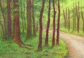
A sketch a day: walk in the park

Trying to exercise patient light strokes after dealing with canvas and rough watercolor paper. Somehow I got too heavy-handed for smooth drawing paper and with this little sketch had to stop and remind myself that the goal was to go with light strokes. As in, light on everything.
White Fantasy
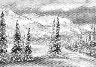
This is my latest miniature partly inspired by a very cold and snowy winter of 2011-2012 and partly made because right now here in California it’s overly warm and sunny even by local standards. In the process of bringing winter closer to me I found out that a digital canvas can take a fair amount of scraping with x-acto knife which is pretty convenient for putting snow over heavily darkened areas.
The original is available in my Miniatures online gallery for $35.00
A sketch a day: Rocky Mountain Horse

A sketch a day: horse in the water


Artist trading card exchange at CAG
Yesterday at the meeting in the Campbell Artists’ Guild we had an artist trading card exchange. This is what I brought, they are my experiments with metal pens and markers combined with colored pencils:


And this is what I got in return:


Pretty wonderful extra gifts for my Birthday! 🙂
