After a long and eventful show life, “Mom & Son” is now going to live a peaceful life in a loving home, surrounded with pastures and happy horses – right where it belongs.
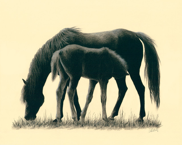
After a long and eventful show life, “Mom & Son” is now going to live a peaceful life in a loving home, surrounded with pastures and happy horses – right where it belongs.

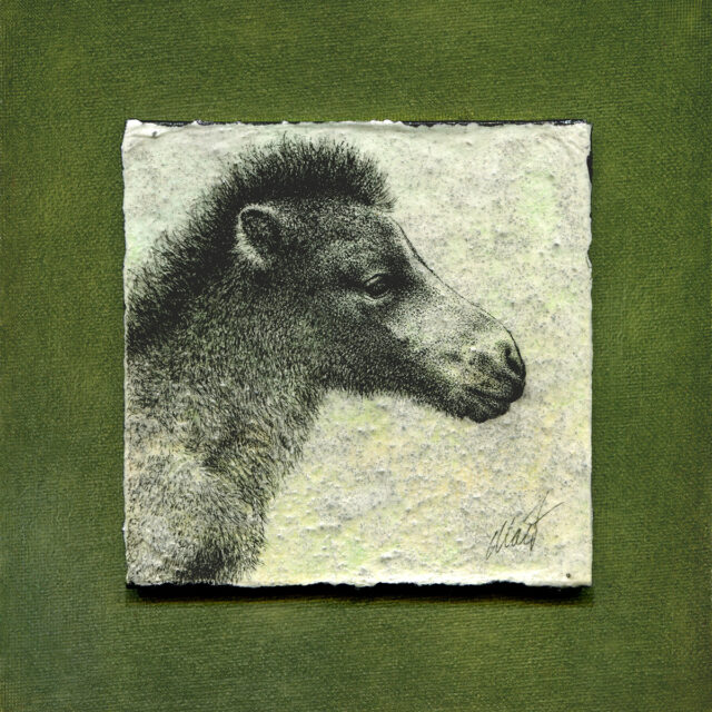
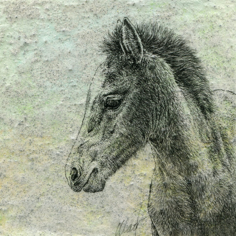
A few years ago, I created a series of foal drawings for the Art for the Heart Gala at The Arts Center in Corvallis. One piece didn’t make it because I didn’t have enough time to meet the deadline, and since then I completely forgot about it.
Last year, as I was packing and sorting everything for the move to the new place, it briefly reminded about itself, but so much was happening at once that only now I finally had time to finish it. Just in time for the upcoming “Annual Color Show: Green” show at the Keizer Art Association!
This little foal is looking for a loving home. The rest of the series has been sold, but reproductions are available:
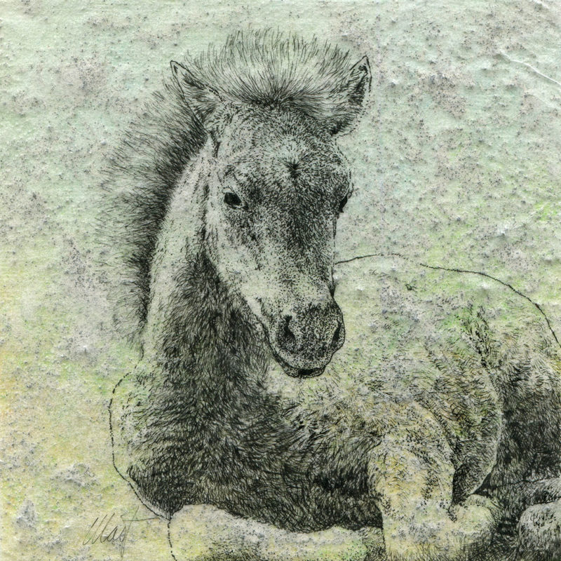
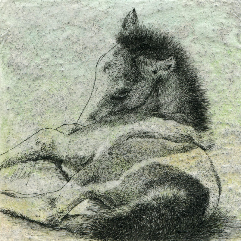


So happy that “Gathering II” and “Gathering III” have been selected for the Bye 2020! exhibition at Blind Insect Gallery! The show will be up December 11th, 2020 – Friday, January 15th, 2021. Blind Insect is an amazing little gallery on Alberta Street, Portland, it’s always full of wonderful artsy gems, and I can’t wait to see what the show will look like.
Show dates:
December 10, 2020 – January 15, 2021
Gallery location: 2841 NE Alberta St, Portland OR 97211 (directions)
Open: Wednesday – Sunday, 11 am – 4 pm
There are so many amazing small artworks by 36 local and national artists, come enjoy them!


Dropped my contribution to the Art Gallery for Art for the Heart that benefits Center for the Arts in Corvallis. I am not sure if the show will be an actual physical one or online only like many others. I haven’t been to the place since way before the pandemic, and it was so nice to walk in and enjoy the current show and new things in their gift shop. It was almost normal. Almost.
Three 5” x 5” drawings make the “Delicate Beginnings” little series. It would be four, but the forth one became a casualty of forgetting to cover the ink drawing with final fixative before attempting to mount it on top of the tissue paper with pastels and powdered bone. It will require heavy touch-up and maybe adding some color to the foal. I am not sure about color yet, but it’s a possibility. Maybe all four would benefit from some color.
More details about the show: https://theartscenter.net/call-for-artists-8×8-art-gallery-for-art-for-the-heart/
The Art for the Heart 8×8 Gallery is going up in the Corrine Woodman Gallery tomorrow.
The show will be up from September 26th till October 8th, 2020.
The current hours of The Arts Center are Thursday – Saturday, 12 pm – 5 pm.
Masks and Social Distancing Required
Virtual Reception
The 8×8 Gallery reception will be held on October 1, 2020 at 6 pm online. It will be the first chance to purchase any artwork in this gallery.
Register for Art for the Heart by clicking here. Registration is free. Also visit The Arts Center’s Facebook page by clicking here for more info.
Gave Faber-Castell PITT pens one more try. A few years ago they seemed not to be dark enough, but things change with time, right? Not these ones, though… Ok, no big deal, I will stick with Derwent Graphik.


Finally mailed my postcard art to the Twitter Art Exhibit (TAE) today. I blame Creatacolor pencils for the delay. It was my first time trying oil-based colored pencils, and as a Prismacolor/Derwent girl I found their behavior way too different.
This year TAE helps an Australian charity, Pegasus Riding For The Disabled of ACT Inc., http://www.pegasusact.com.au/. All proceeds from postcard art sales go to the charity. If you feel like helping out, the deadline for submissions is March 19, 2018: http://twitterartexhibit.org/call-for-artists/
Here is how “Character” came to be.


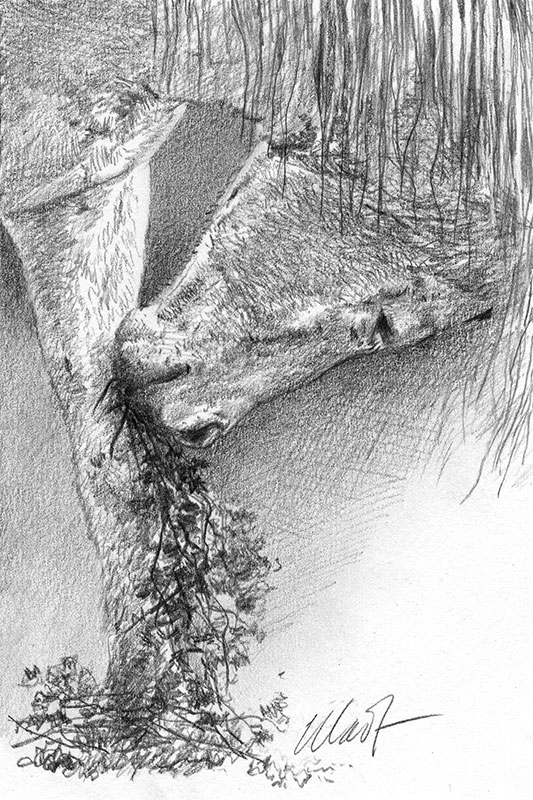

It’s a tough life for a horse when she needs to munch and scratch an itching knee but has only one set of teeth for everything.

That’s my sketch on the go from earlier this week finished. I wanted to see how much texture could be built on Canson drawing paper with pencils only, without any other tools. To my surprise, the paper let be create quite a few nice subtle patterns. I especially like those crossing lines on the horse.


Decided to make progress with the horse first and with the window frame later. Both are going to differ a bit from my reference, and because the horse is more important I am going to figure out where his colors end before touching the window. I am now debating between natural wood and old paint that would compliment the horse.

So it was a good idea to use graphite first, then continue with color on top of it. Maybe a softer grade like H6 would be more efficient, especially on a textured paper like this one. The disorganized colors that are already there are from different kinds of strokes I tried to see what works better.

Back to the unfortunate horse who is now ready for color! I am done with the graphite underdrawing (if this is not a word it should be) and securing it with a workable fixative. Let’s see if that speeds up adding darks with colored pencils. Rainy shooting conditions made it look like there are at least two different tones of graphite, but in reality it’s the same tone.

I don’t think I have ever been this excited to see a rough drawing of a horse head finally appearing on a piece of paper as planned. There were at least two iterations that were not to my liking at all, but finally everything is where it should be, the sketch is transferred to the final watercolor paper (it’s a Strathmore one with nice slightly uneven surface), and I can move on to preliminary shading with graphite.
The horse is picking out of a barn door window, but it is barely visible right now. I need to decide whether to keep it white like in the reference photo or make it natural wood. The horse is going to be light chestnut with a lot of color nuances in the face, and even weathered white seems to be too stark next to all that, so most likely I will use some kind of amber or light wood for the window.

Did a sketch for a girl who loves horses (should probably be in all capitals and blinking) and dreams of riding her own horse one day. Until then, a very own drawing of her favorite 4-H equine will have to suffice. This is a Birthday gift to her from her big sister.


Miscalculated where the horse should go on the piece of paper, but otherwise happy with the sketch. The subject was a beautiful chestnut, most likely a resident of the horse boarding facility across the street from our home in Cupertino, CA.

Despite several amazing finds among drawing apps and all niceties they offer, I find myself again with a piece of paper and a graphite pencil. Must be a habit.


I am gradually making friends with Painter Mobile Pro. Most of it happens on the Galaxy 5 phone because the screen on my tablet responds to a stylus a little erratically. The phone allows to draw surprisingly precise thin lines, it does not mind blending, smudging, or multiple layers. Well, for the most time. Every now and then it needs a little time to show me the result. Very handy for sketching on the go but still does not exactly a replacement for real tools and paper.

I wanted to finish this one yesterday and make it my last horse drawn in the departing year of the Horse, but of course that didn’t happen. So let it be the first horse of the new year with many more to follow.
I want to thank you all for following me and supporting my art and wish you all the very best in the new year 2015!
I will have a few pen and ink pieces in this show:


If you are in the area, stop by for the opening reception on December 5th, starting at 7 pm.
HARK! 9th annual holiday exhibit & sale is open from December 5th, 2014 through January 16, 2015.
KALEID gallery is located at 88 S 4th St, San Jose, California 95112
Updated: October 26, 2014
It’s finished. I like how it turned out more than the first two pieces in the series.

Updated: October 17, 2014
So most of my ideas are not suitable for small shapes and have to be put aside for now. I think there is a larger rocky piece in my feature; meanwhile this one continues to take shape.

Updated: October 2, 2014
I have more ideas for rock textures that are going to fit into this small piece, and not all of them are going to play nicely together. Decisions – they are very time consuming.

Original post: September 9, 2014
For the third piece in the “Gathering” series I decided to start with the horses instead of smaller rocks. Apparently it is easier to complete more critical parts of the drawing first than worry about ruining the entire thing if something in the horse does not look right. Who knew! So, outlines are done, one foal is completed but may need some touch-ups when I get to its rock, the other one is not giving me problems so far.

You can see the first two drawings in the series here and here.
Newborn won the Best Realism Award at the Fall Festival Art Show
And it’s done! I don’t think there is anything to add to it, but if I were to do this piece all over again I would approach it completely differently. It was a nice detour from fully realistic colors and a few purely technique-related things I usually use.

He looks more like a living creature now and almost ready for darks to be added. The white stripe will need some gentle work first.

Well, it’s been a while since I started this portrait, several different small projects got in the way, but finally I am back to the little foal.
In the end, he won’t be nearly as colorful as right now (or at least I hope for that), but it will be interesting to see what bright violet and yellows will be able to add to regular coat colors.

I think it’s been a terrible while since I drew a horse that fits on piece of paper bigger that 4″ x 6″. Time to change that, so here’s the beginning of a very young foal’s head. Because for some reason I chose rough Bienfang watercolor paper, it may take a while to build up colors in this one. And it’s not just rough, it’s somewhat slippery too. But we will see. So far it was mostly working on the background to get a better feel of the paper that is new to me before adding much detail to the foal.


Very quick, less refined than the previous horse head, an “I can see you, you can’t see me” kind of a horse.


University Art carries something I never saw before: a canvas mounted on a cardboard. 5″ x 7″ pieces are sold unprotected, unlike canvases and real sturdy canvas boards. They come in white and black versions. Naturally, I had to buy both to see what can be done with them.
This white horse was done on a black one. Even though the canvas accepts many layers of color the result is not purely white (hence the “ghostly” reference). Alas, colored pencils are not completely opaque.
The original drawing found a new home at the Midsummer Art Festival 2014, but greeting cards, and prints are available in my online shop as a part of the “Colored Pencil” collection.

Fun fact: Sharpie marks sip into drawing paper surprisingly fast. So fast that even quick sketches like this one become a battle against ink blobs appearing in the most undesirable places. It’s kind of funny as long as I make the exercise short and repeat it rarely enough to forget that reaching for a Sharpie is not a better option than hunting for a normal drawing pen hiding somewhere in the depths of my drawers, bins, and cans.

As busy as this year’s Silicon Valley Open Studios were, I managed to snatch up some time for drawing. The result is the second piece in the “Gatherings” series that was finished yesterday a couple of hours before the last day of Open Studios in front of the Cupertino Library was over.
Thank you everybody who came to see my art, to ask questions, share your stories, and support what I enjoy to do so much. Those were three wonderful weekends!
