
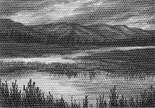
September 15, 2013 sketch – graphite & bronze acrylic, 6″ x 4″
Author: Yelena Shabrova
Explorations in Colored Pencil II
Today the San Francisco Chapter of the Colored Pencil Society of America had an opening reception for their annual juried show, Explorations in Colored Pencil II. We drove down to the Coastal Arts League Gallery in downtown Half Moon Bay hoping to make it in time, and luckily for us the traffic was very bearable.
The show is great, and I am not saying this because I am very partial to the medium. It’s really a strong collection of different styles, techniques, and subjects.
The show will be open till October 6, 2013.

Malibu Succulents, by Phillip Zubiate III

Malay Lacewing, by Denise J Howard
Inspiration is for amateurs…
There was a quote from Chuck Close on A.C.T. Art MArketing Blog part of which rang true to me:
If you wait around for the clouds to part and a bolt of lightning to strike you in the brain, you are not going to make an awful lot of work. All the best ideas come out of the process; they come out of the work itself.
I don’t put the entire quote here because I am not all that sure about the beginning which is about inspiration being for amateurs and because the rest merely expands on the excerpt above.
It’s a fact, at least for me, that waiting around for an idea or looking at work of others gets me nowhere and eventually it feels like I’ve got a solid brick in my brain that makes it impossible to create anything. I do enjoy looking at what other artists do, by the way. I could do it all day long, it just does not help with the problem at hand. Drawing without much expectation is far better. I can abandon the original idea before I get too far, change it while it’s still changeable, throw the entire thing away because it refuses to cooperate, or base another drawing on the original failure. All of it is still more productive than waiting for a miracle to happen on its own.
There is no shortage of advice on getting inspired and getting over a creative block; I trust it makes a real difference for others, but for some reason it’s not doing much to me. Maybe I am approaching it the wrong way?
March 13, 2013 sketch
Long time ago I was asked for a commission of a black cat, but the reference photo provided consisted mostly of beautiful amber eyes and some very dark blobs that suggested the cat surely was somewhere there in the almost black surrounding. I could not even guess the rest of his face, so asked for a better photo and never heard back. But what was not good enough for a commission once, could work for my own amusement. This is a different cat, and I am not sure how so much of it besides the eyes got into the sketch. It was not planned for.

colored pencil on colored paper, 6″ x 4″
Sketchy horse

“Sketchy” is a style in Harmony that I like the most. Besides being imprecise and somewhat unpredictable by nature, it does not take kindly to thinking as you draw. The result is always a disaster, and the later in the process it happens the worse it looks. Since this is my first attempt to draw a horse in Harmony, disasters happened more than once. Luckily, I only use black and white, so for the most part when black gets out of control I managed to offset it with white. It’s not exactly erasing, but I think it works.
Other things I learned:
– colors in the color wheel come out anything but what I select and what shows in the preview square. Grays always have some odd tint, so I had to drop the idea of using them, or this would be one psychedelic horse head. I was not in the mood for psychedelic at all.
– apparently just because you can draw on the sides of the toolbox that is centered at the top of the page, it does not mean that you can draw behind it too; that’s how the horse lost nice pointy ears that I was going to give her

A growing… something

I haven’t visited Harmony for a long time, not even sure why. It’s a great place to get unstuck (and I am stuck thoroughly with an abstract piece right now), to unwind after a stressful day, and to doodle away no matter what your circumstances are.
Harmony is perfectly capable of helping you make realistic art, but that I could do on my own, right? So for the most part me and Harmony create strange things like this one.
Further experimenting with canvases
Looking back at all my attempts to make colored pencils play nice with the digital canvas, I have to admit that they certainly prefer a traditional linen one. So the blank digital canvases that I still have will be used for other media. For example, a graphite pencil:
Miniature – graphite pencil on canvas, 3.5″ x 2.5″
Things learned with this one:
– only soft graphite works, harder grades scrape the priming off the canvas without leaving noticeable marks
– for blending, small sponge makeup applicators and bristle brushes work best
– common erasers are of little help when you need a highlight or to scrape off a mistake, but kneaded eraser works wonderfully (I am using a Koh-i-Noor Hardtmuth eraser that comes with its own case and like it better than other brands I had before)
– an x-acto knife can be good for small bright highlights, but using it requires care because it easily gets deep into priming and scrapes it off
– areas treates with a x-acto knife are still good for blending tools, but pencil marks behave unpredictably, so better be avoided
My other canvas experiment that is yet to be finished is a mix of the black India ink and graphite. I am not sure how I like the result so far, but we’ll see.
Pinterest: an Opportunity for Creators – or a Threat?
Mark McGuinness posted a great article on the Pinterest for artists issue, Pinterest: an Opportunity for Creators – or a Threat?. A lot of good points there, but do not stop with the article itself or with links to posts in other art marketing blogs about Pinterest. There is a lengthy and insightful discussion in the comments very well worth reading (I could not help but add my $0.02 too).
To me, the amount of attention that Pinterest is getting is amazing. How comes that images of artworks have been shared everywhere for a long while now, from Facebook to Tumblr, often without artist’s consent, and nobody made a big deal out of it? Or did opponents of image sharing only now caught up to the new reality? Is it really such a big deal? Pins are small, unfit for reproduction, even on a very amateurish level. Plagiarism concerns? Artists risk that every time they put their creation on display. Traffic stealing? Now that was probably the most unusual claim I’ve heard, complete with the total lack of supporting facts. Puzzling…
Miniature on canvas with a boardwalk

This one was created with Derwent Coloursoft pencils, not my usual Prismacolor. The good thing is that these pencils are really, really soft and blend together easily. The bad thing is that in just a few layers it becomes impossible to add more color. The next stroke tries to lift off what’s already on the surface. This is not such a big deal with lighter colors, but getting good darks with Derwent on canvas (at least on a digital one that was used for this piece) turned into a challenge. The solution: use a softest graphite pencil you have. Koh-I-Noor Hardtmuth 7B worked quite well for me.
New miniature on canvas

colored pencil on canvas, 3.5″ x 2.5″
Most of this one was done with an artificial light, and today I was going to put finishing touches on it while we were at the Pescadero Beach. But the sunlight showed me that more than just that was needed. Good thing that the weather was very warm and without strong winds, or the miniature would travel back home to be finished there. I must say though that colored pencils start to lay on the canvas in a funny way as humidity goes up. I think if I was working with water soluble ones, I would end up with a painting without adding water.

Two artworks at the National Competition & Exhibition “Ode to California,” July 1 – 28, 2011
Russian Ridge View and Summer Day in Santa Cruz Mountains were accepted into the juried exhibition at the Pacific Art League. The juror is Kenny Harris.
Commemorating PAL’s 90th anniversary, the exhibition “Ode to California” is about the historic transformation of the state, its people, place and culture.
Pacific Art League is located at 668 Ramona Street, Palo Alto, CA 94301-2545.
The exhibit is open July 1 – 28, 2011.
You are invited to the reception which is on July 1, 5:30 pm – 8 pm.

Russian Ridge View – colored pencil on colored paper, 9″ x 6″

Summer Day in Santa Cruz Mountains – colored pencil on watercolor paper, 14.5″ x 10.5″


“Running Free” at “Fur, Feathers & Fins,” 6/3/2011 – 6/23/2011
One of my drawings, “Running Free,” was selected for a juried exhibition at the Pacific Art League. It is called “Fur, Feathers & Fins.”
The exhibition is open from June 3, 2011 till June 23, 2011.
Pacific Art League is located at 668 Ramona Street, Palo Alto, CA 94301-2545.
I will be at the reception during the Palo Alto First Friday Art Walk. It’s on June 3, 5:30 p.m. – 8 p.m.

Getting a hang of it (digital canvas, that is)
Finally, a miniature on a digital canvas that was not a struggle:

colored pencil on canvas, 3.5″ x 2.5″
I noticed that colors almost do not smear at all on this type of canvas and put dark branches first, then moved to the clouds. It worked – branches stayed dark, clouds stayed clean, no mess at all. And it probably helped that I used harder Derwent pencils for the branches and my usual Prismacolor ones for the rest.
A new miniature and a rather unpleasant discovery

colored pencil on canvas, 3.5″ x 2.5″
That’s the pleasant part, always good to finish even a little piece. Now, the unpleasant one: this miniature, like the previous two, was done on a digital canvas, and apparently it has a shorter patience with multiple layers of color than a traditional canvas does. In the process of “thinking” about earth colors right on the canvas I found out that I better make up my mind quicker, or the color will start to chip off. It didn’t really come to chipping off, but from my previous experience with paper I know the feeling that the pencil gives you right before the surface gives up. That’s a little disappointing, or maybe it’s a good opportunity to learn how to be more decisive.

A miniature that traveled to Russia and back
That’s right, this little piece went with me over half of the globe and back. I had big drawing plans while visiting with my family and friends in Russia, and as it usually happens very little of it got accomplished. In fact, this is the only thing I managed to finish in 3 weeks, all done either in flight or in airports. Yay for working small.

colored pencil on canvas, 3.5″ x 2.5″
Silicon Valley Open Studios 2011
I will be showing during all three weekends of SVOS at the following locations:
Weekend 1
May 7 – 8, Site 539
Graniterock Design Center
1505 So. De Anza Blvd., Cupertino, CA 95014
See the map
Weekend 2
May 14 – 15, Site 501
Fongwei Liu Studios
3754 Pruneridge Ave , Santa Clara, CA 95051
See the map
Weekend 3
May 21 – 22, Site 481
Carolina Mueller Studio
10823 Wilkinson Avenue, Cupertino, CA 95014
See the map
All sites are open 11 am till 5 pm.
Join me and other artists for three weekends of art and fun. Come to chat, enjoy refreshments, and see the newest original art, prints, cards, and gift items.
My page at SVOS.org:
http://svos.org/artist.php?id=1907
A mini sunset and a new surface

As much as I enjoy the gessoed canvas, it has one serious problem when it comes to colored pencils: the unsupported area inside the mini stretcher bars. I found two workarounds: working with a very sharp point that does not require much pressure and keeping a finger against the back of the canvas when I need to burnish. Unfortunately, burnishing does not happen without pressure.
Slava suggested to try a digital canvas on a piece of wood. We had a few samples left from the time when he was in the process of finding the best canvas for his photography, and he stretched one for me. The sunset above is my first mini landscape on the new surface. Lessons learned:
– a digital canvas is finer and more dense
– it has more “tooth” (or what should it be called in this case?), and even a slightly dull point will leave white gaps on it
– it is not possible to correct small mistakes with a white pencil on a digital canvas
– all strokes, even those made with a dull point, look harsher on a digital canvas than on a traditional one
It feels like a good surface, I just need to adjust to it.

Fall colors – a new miniature
Fall colors are almost non-existent outside of urban areas here. The best we see when hiking is a few colorful trees or shrubs here and there. The rest is either brown or green that later turns bare. But there is a a nice aspen grove at the edge of the Stevens Creek Park, it actually turns golden in October. It’s a wonderful sight then – glowing trunks and branches against bright yellow foliage. The only thing that can make it better is a backdrop of either blue skies or water.
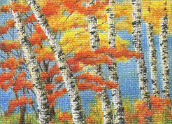
colored pencil on canvas, 3.5″ x 2.5″
I know that Sunol Park looks pretty impressive in fall too, but for one reason or another we keep missing its autumnal beauty every year.
Open Space
Sunshine, light clouds, and blue skies – everything our weather at the moment is not. I do not mind misty and rainy one single bit, but somehow it is not what I want to draw.

pastel pencil, 5″ x 7″
The original ($140.00), greeting cards, and prints are available in my Pastel Pencil online gallery. The original went to a new good home!
Artist Trading Card Exchange at CAG
We had an artist trading card exchange at today’s CAG meeting. Here is my contribution:

colored pencil on illustration board, 2.5″ x 3.5″
That’s my first experience with the illustration board, I am not sure if I liked it. The thing has no tooth at all, very weird. Not sure who got my card, the exchange took place at the very end of the meeting and was a little hurried.
And this is what I got from a fellow CAG member, Sharon LaBouff:

I am very pleased to have Sharon’s little piece.

